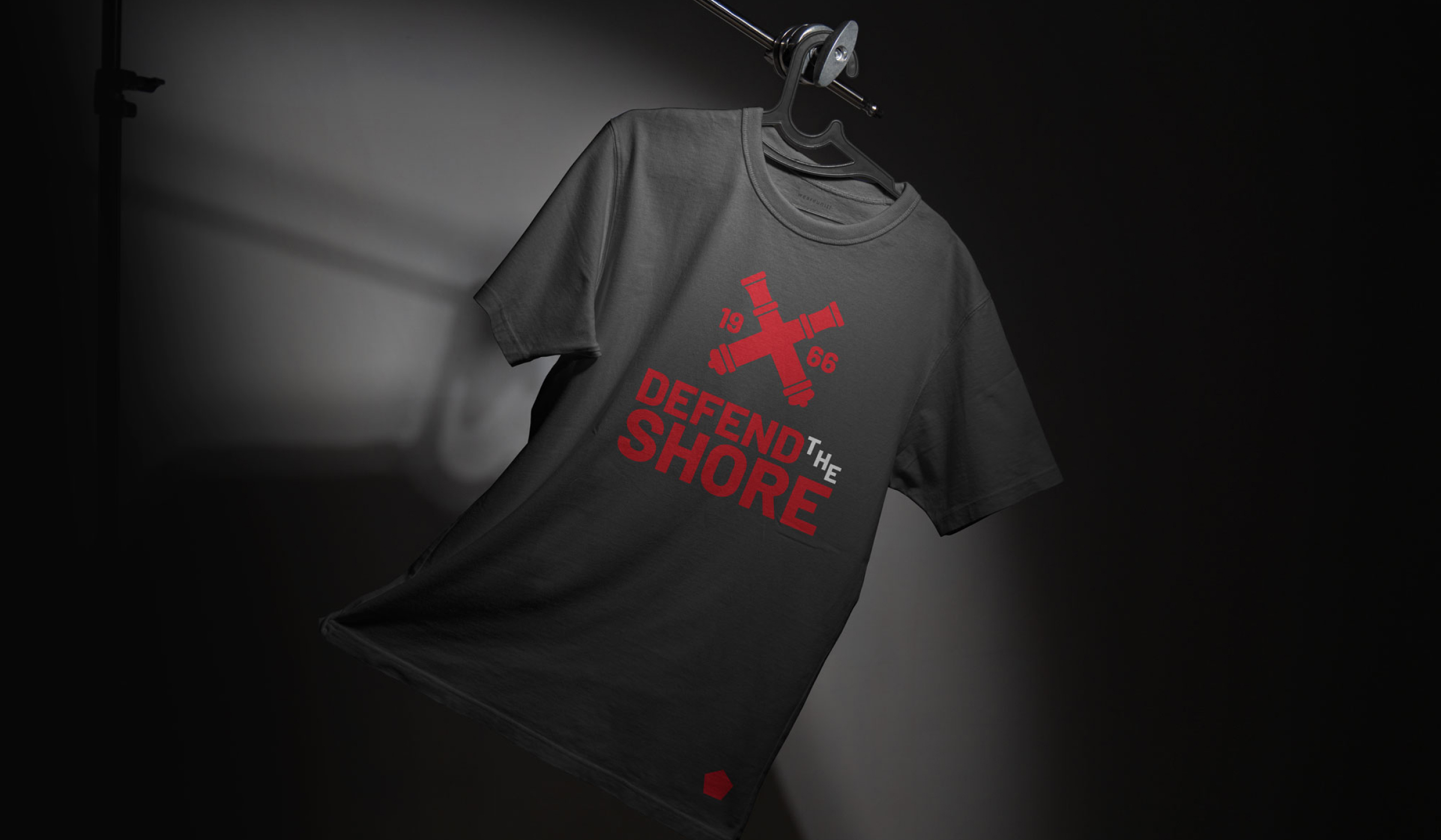
We initially tried to cut corners, but nothing compared to the quality we received with Jonathan. Once we saw the impact of his work on our players and community, it was clear: this was an investment we couldn’t afford to skip. The new crest isn’t just a logo — it’s a statement of who we are as a club.
Clients
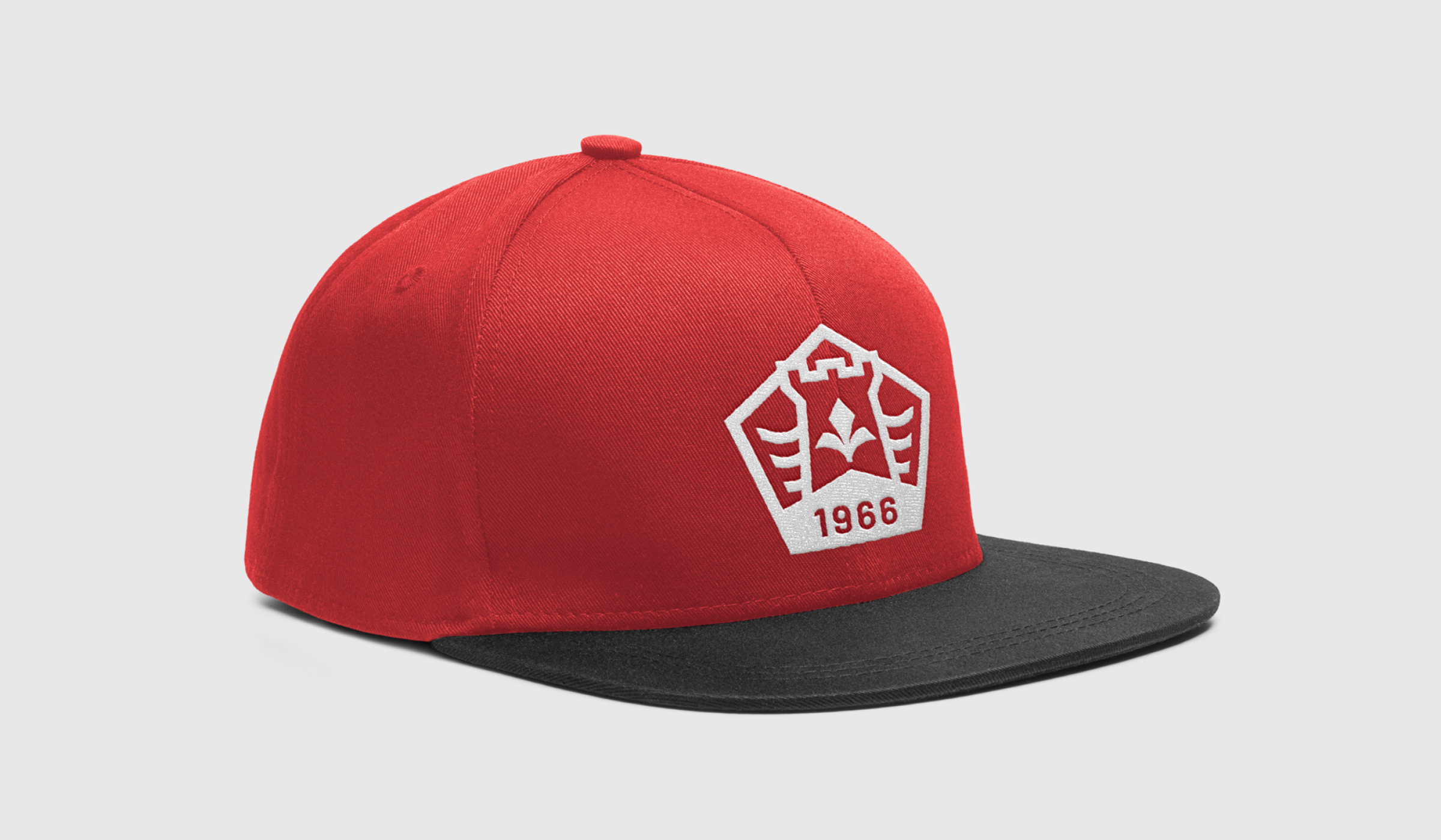
Lakeshore Soccer Club
Year
2025
Project
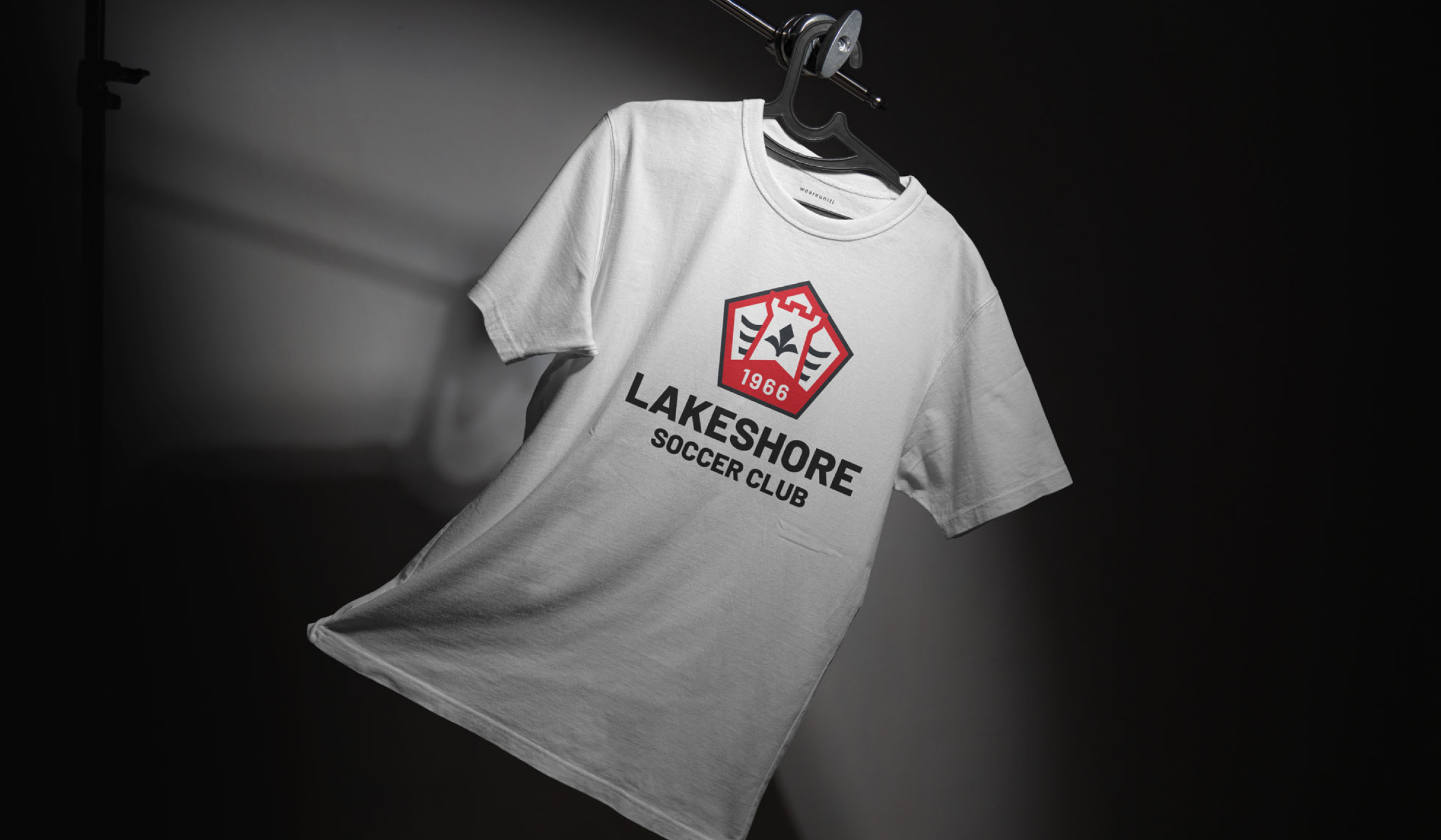
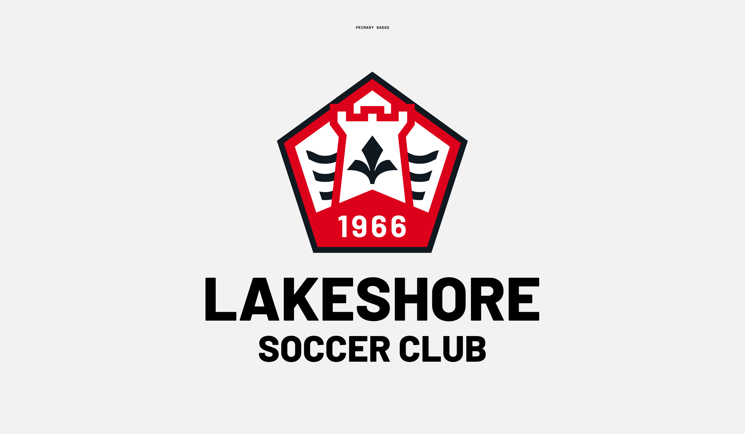
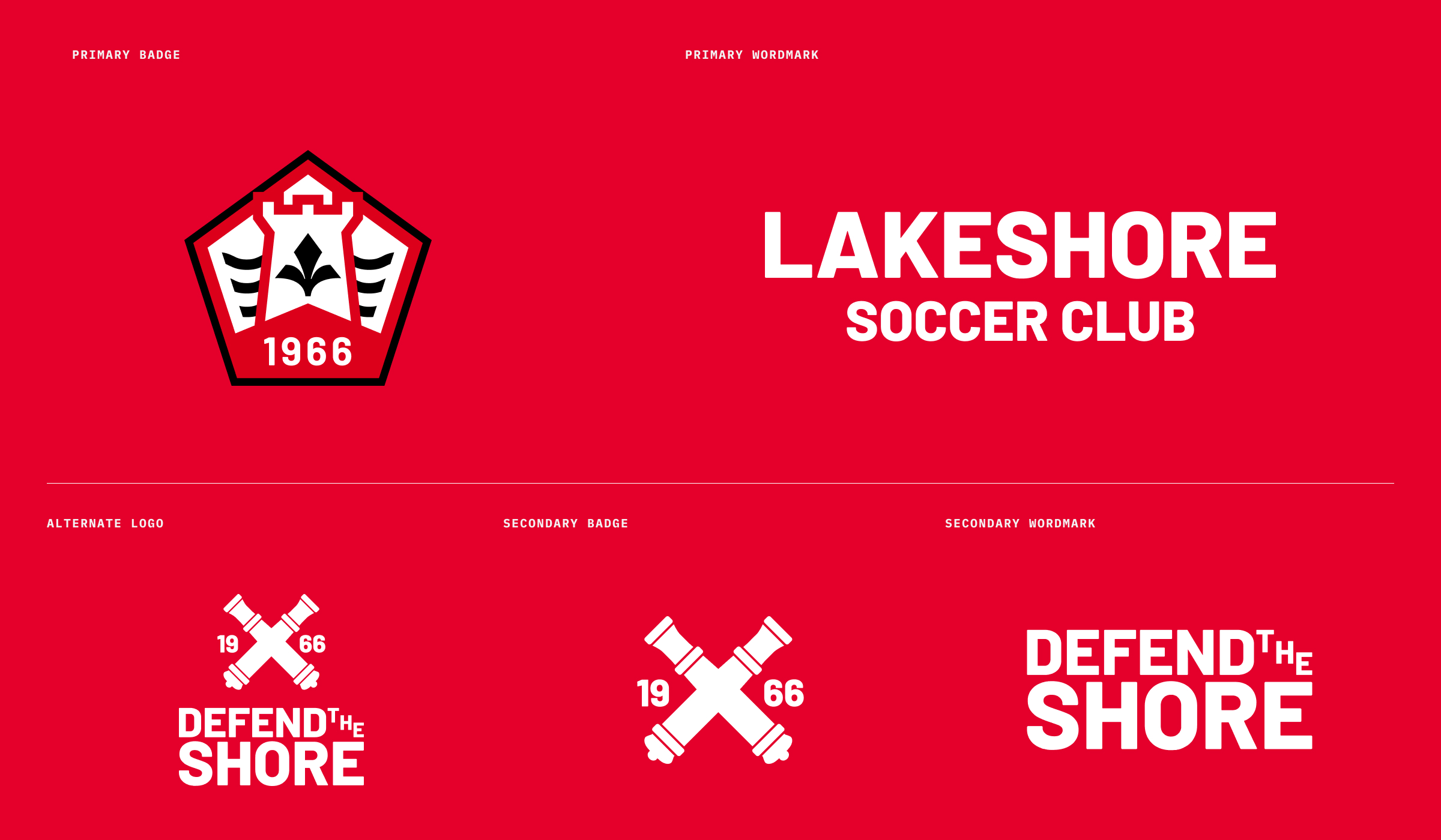
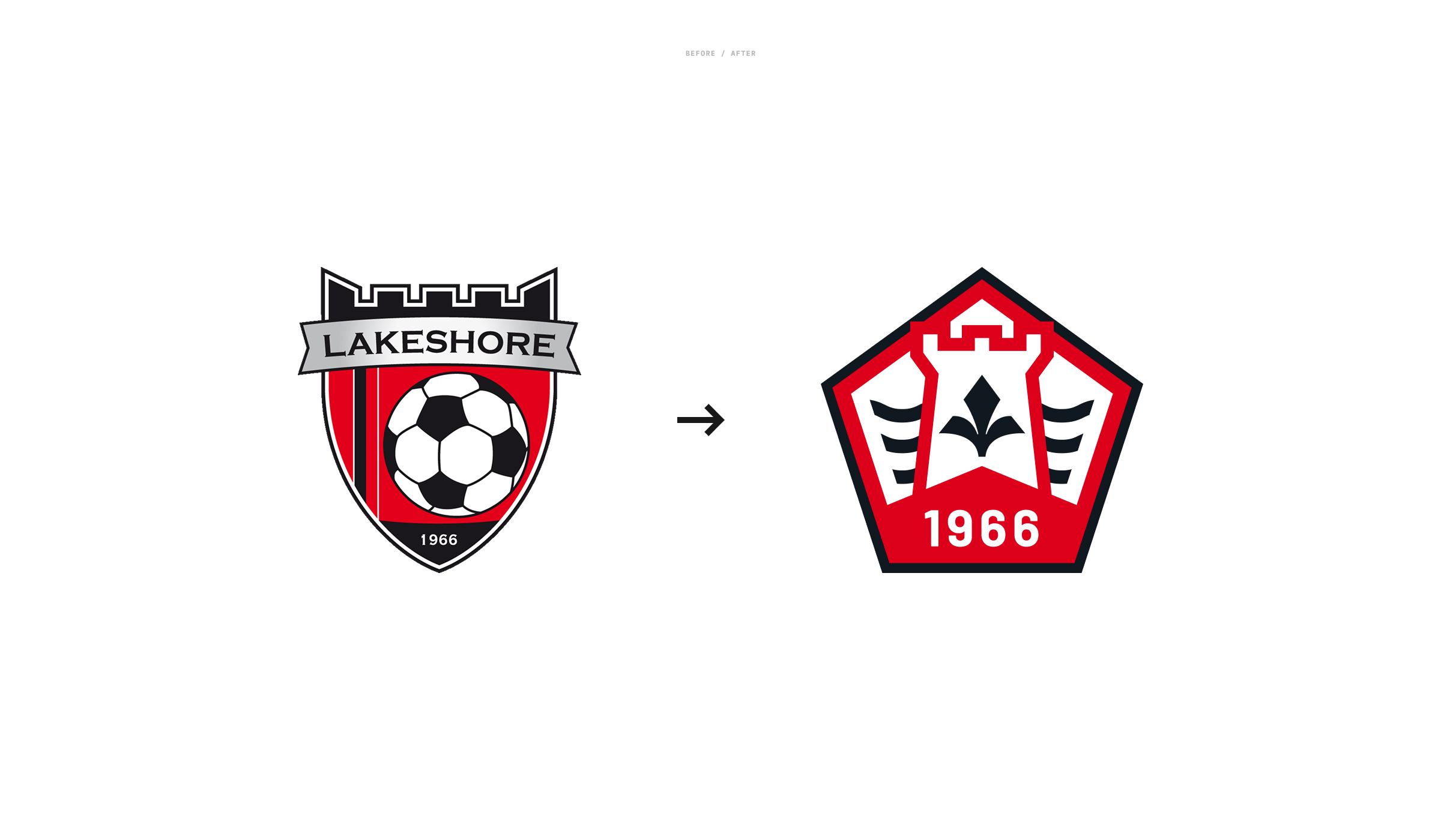
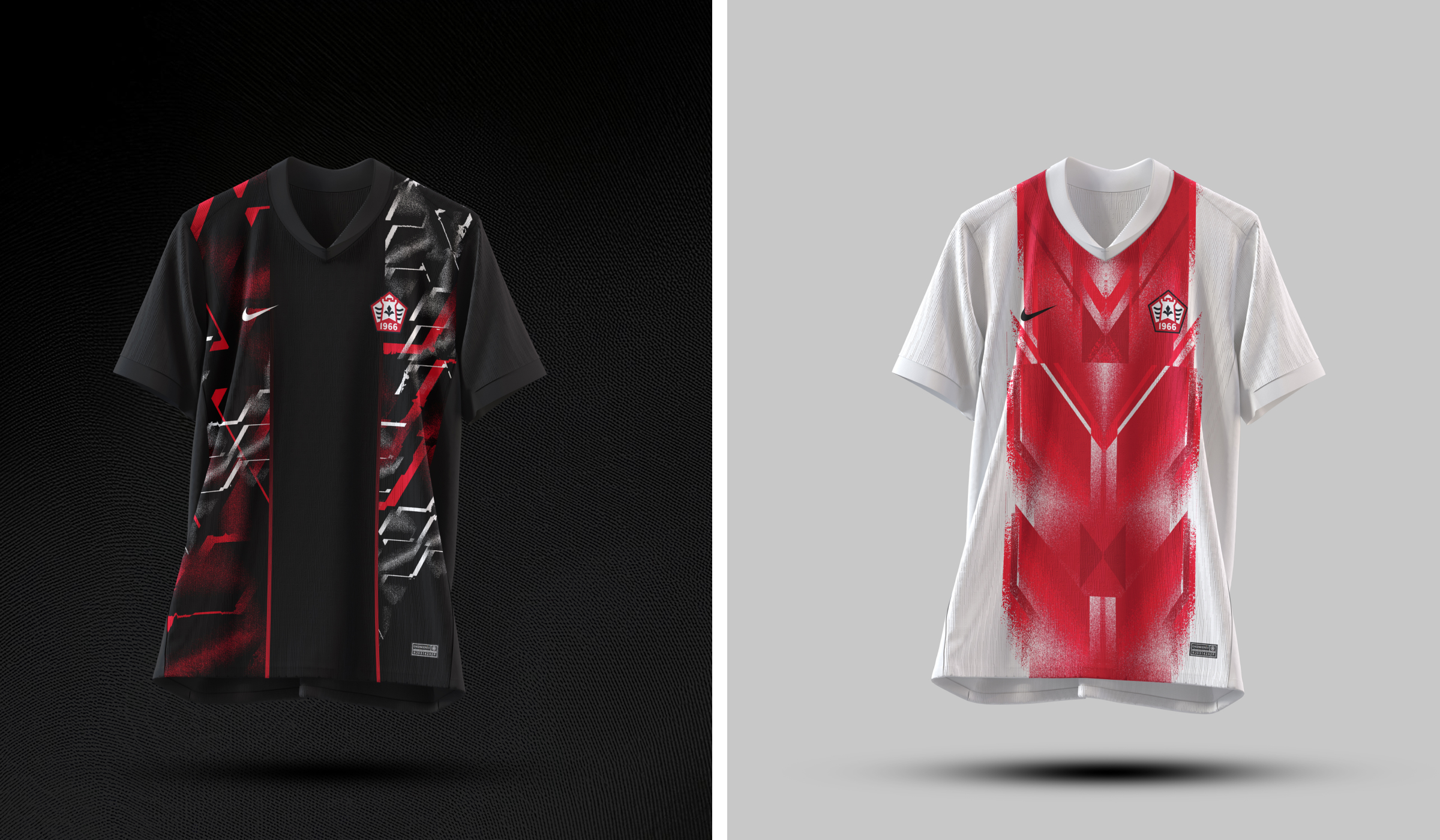
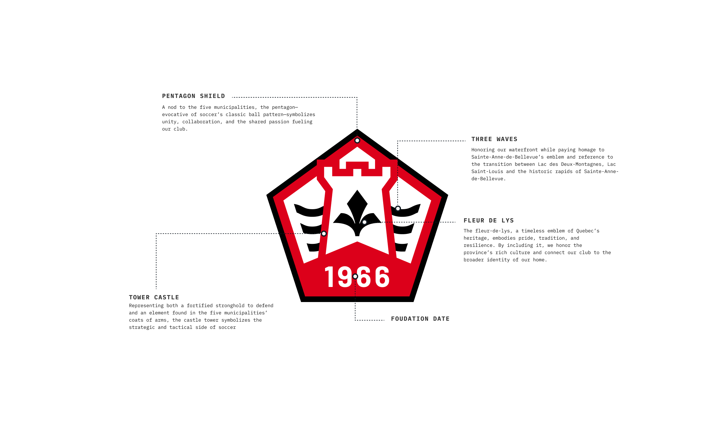
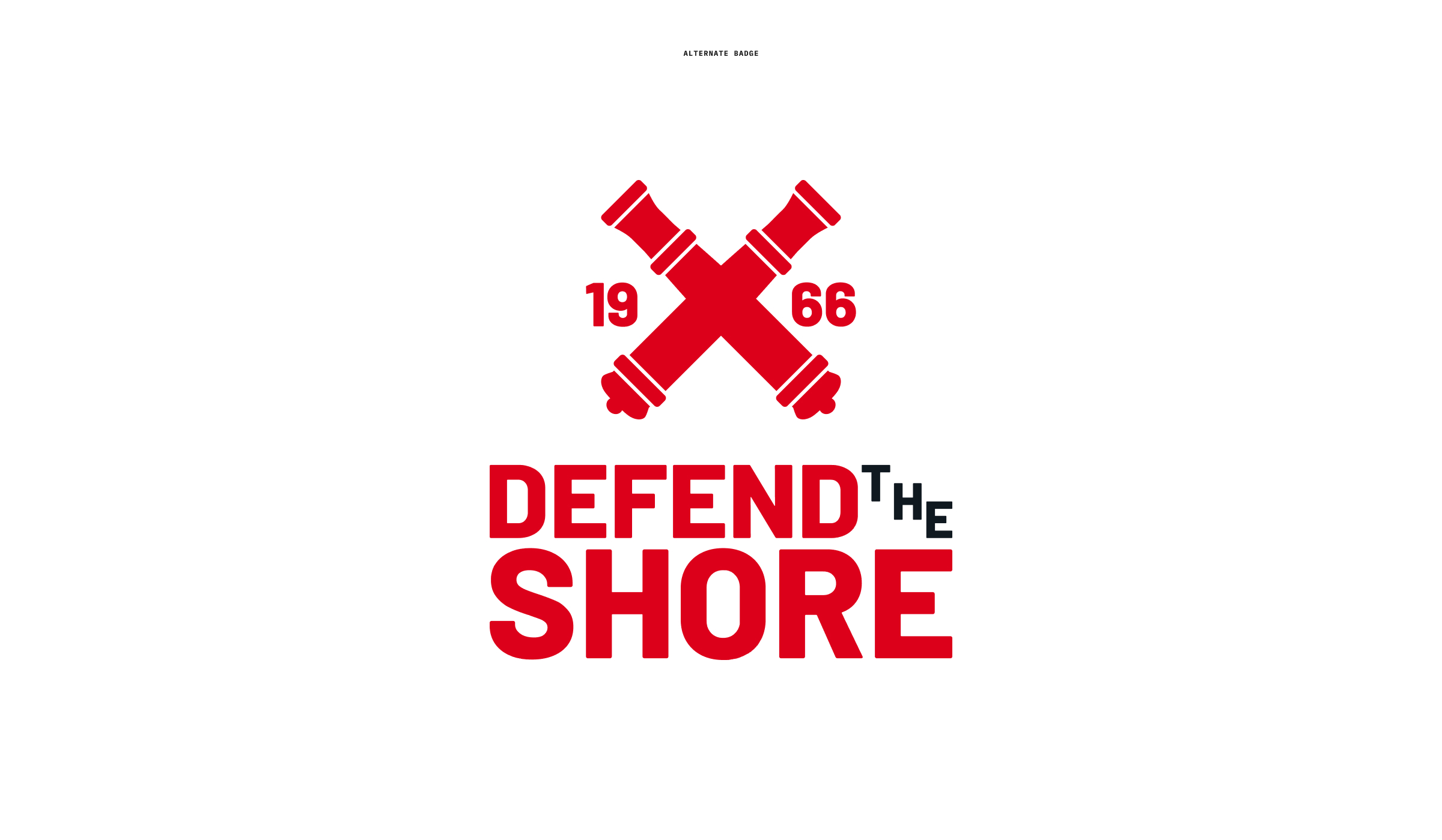
A new chapter begins for this storied club, bringing together five historic boroughs under one unifying banner. Their existing visual identity—though it carried a sense of tradition—needed a renewed look that better reflected their collective spirit, deep heritage, and unwavering ambition. Our challenge was to create a symbol that merges the boroughs’ individual stories into an iconic, modern crest, while celebrating the club’s legacy on and off the field.
Ambition
We set out to bridge past and future. Drawing on inspiration from each borough’s coat of arms—Baie d’Urfé, Senneville, Sainte-Anne-de-Bellevue, Kirkland, and Beaconsfield—our goal was to craft an emblem that resonates with long-standing players and parents, and new ones alike. Beyond merely combining visual cues, we aimed to evoke pride, resilience, and community at every glance. The result is a dynamic, contemporary identity that confidently declares the club’s ascent and reflects its competitive drive.
Services
- Brand Logo