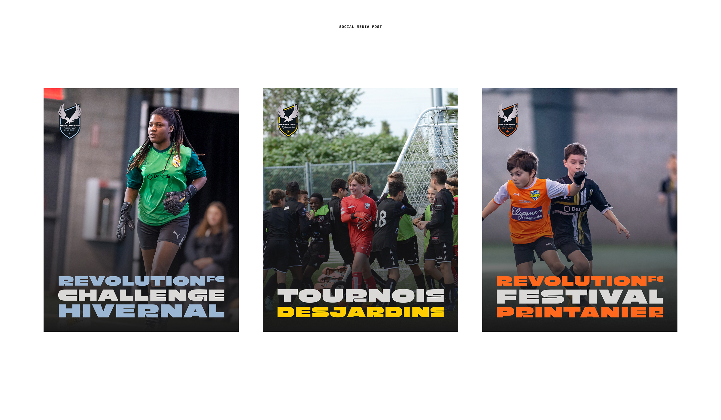
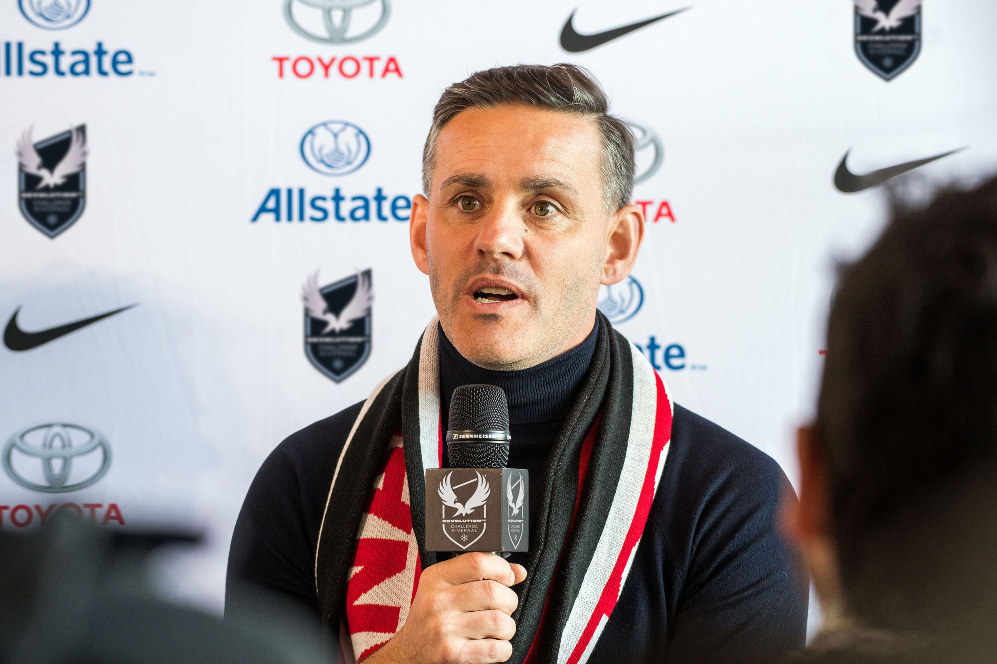
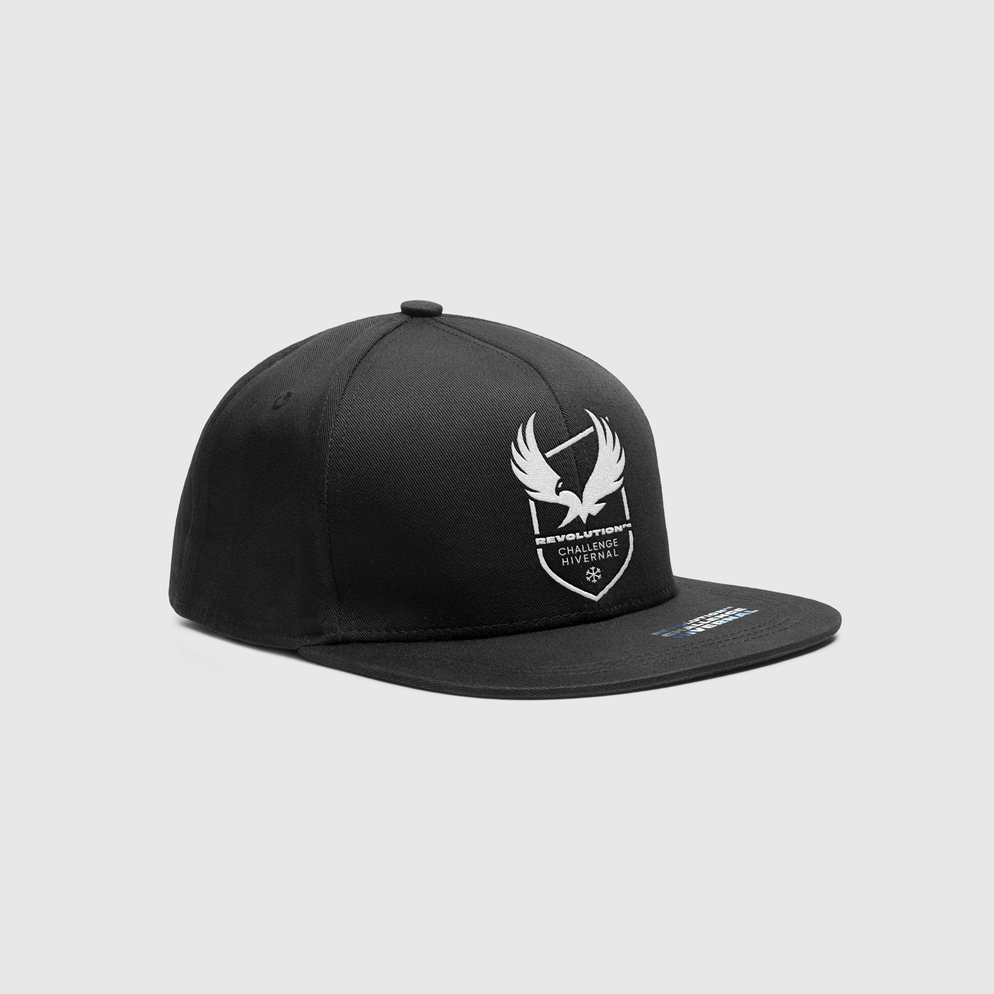
When we needed distinct logos for our Winter Challenge, Spring Festival, and Summer Tournament, Jonathan captured the spirit of each event while maintaining one cohesive brand. Our players and teams immediately connected with the new designs. We can’t wait to see them on the field!
Clients
REVOLUTION FC
Year
2024
Project
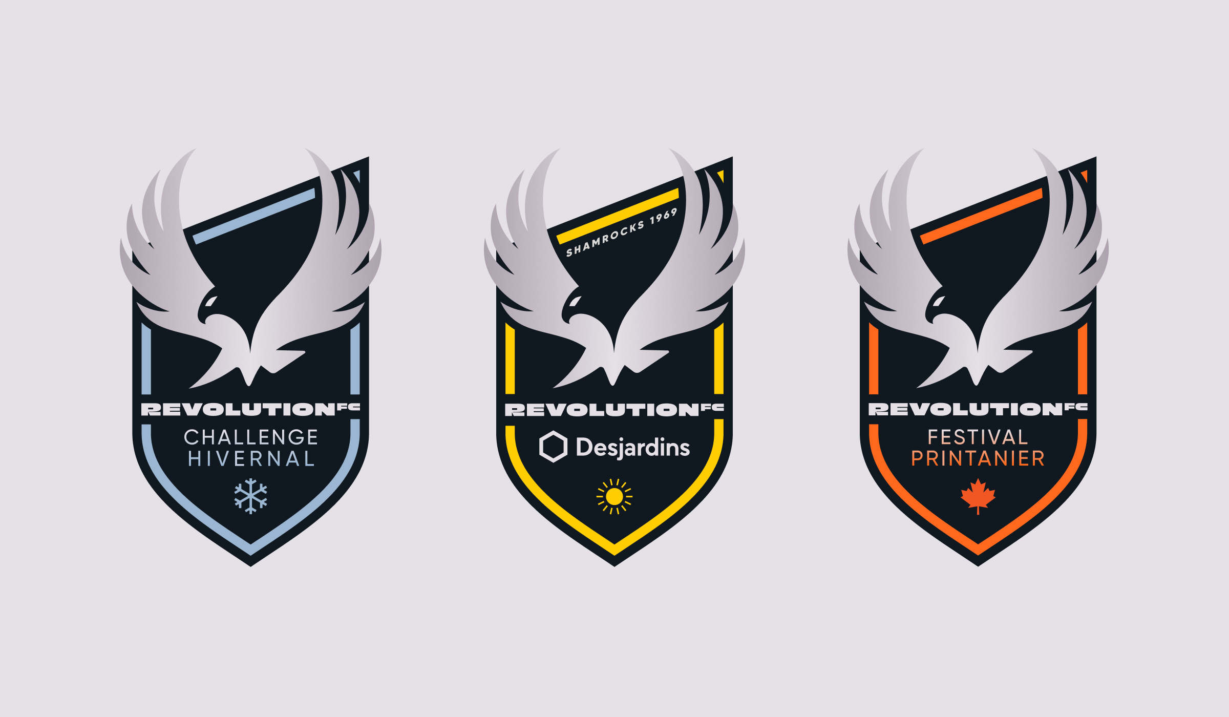
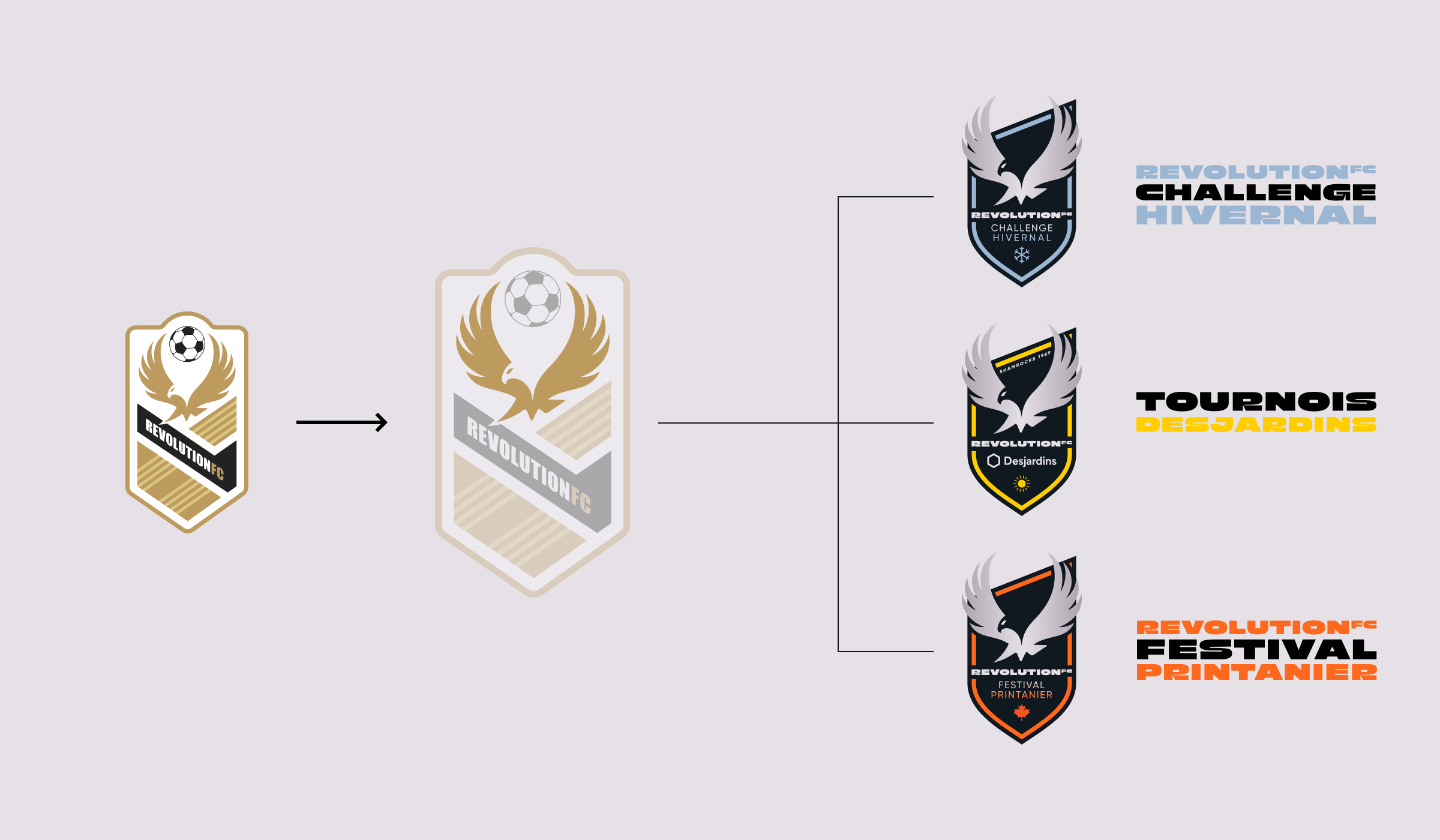
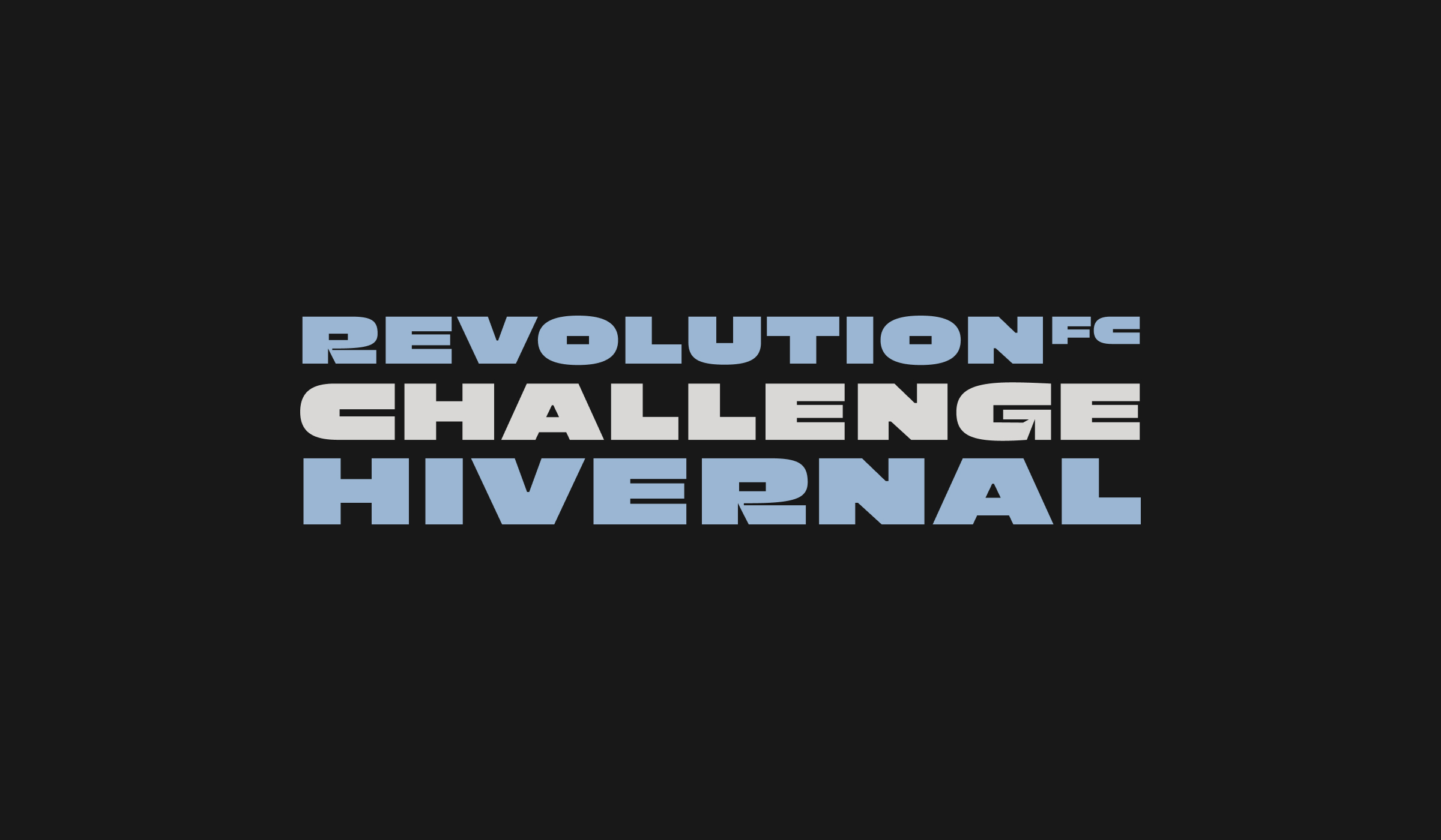
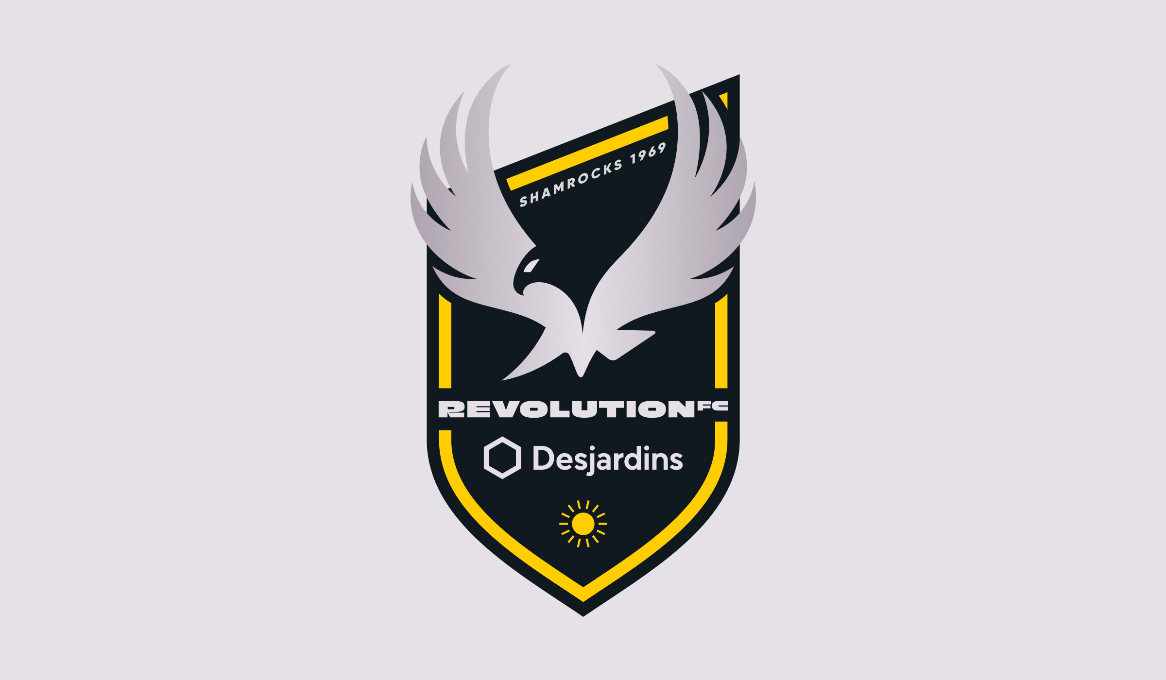
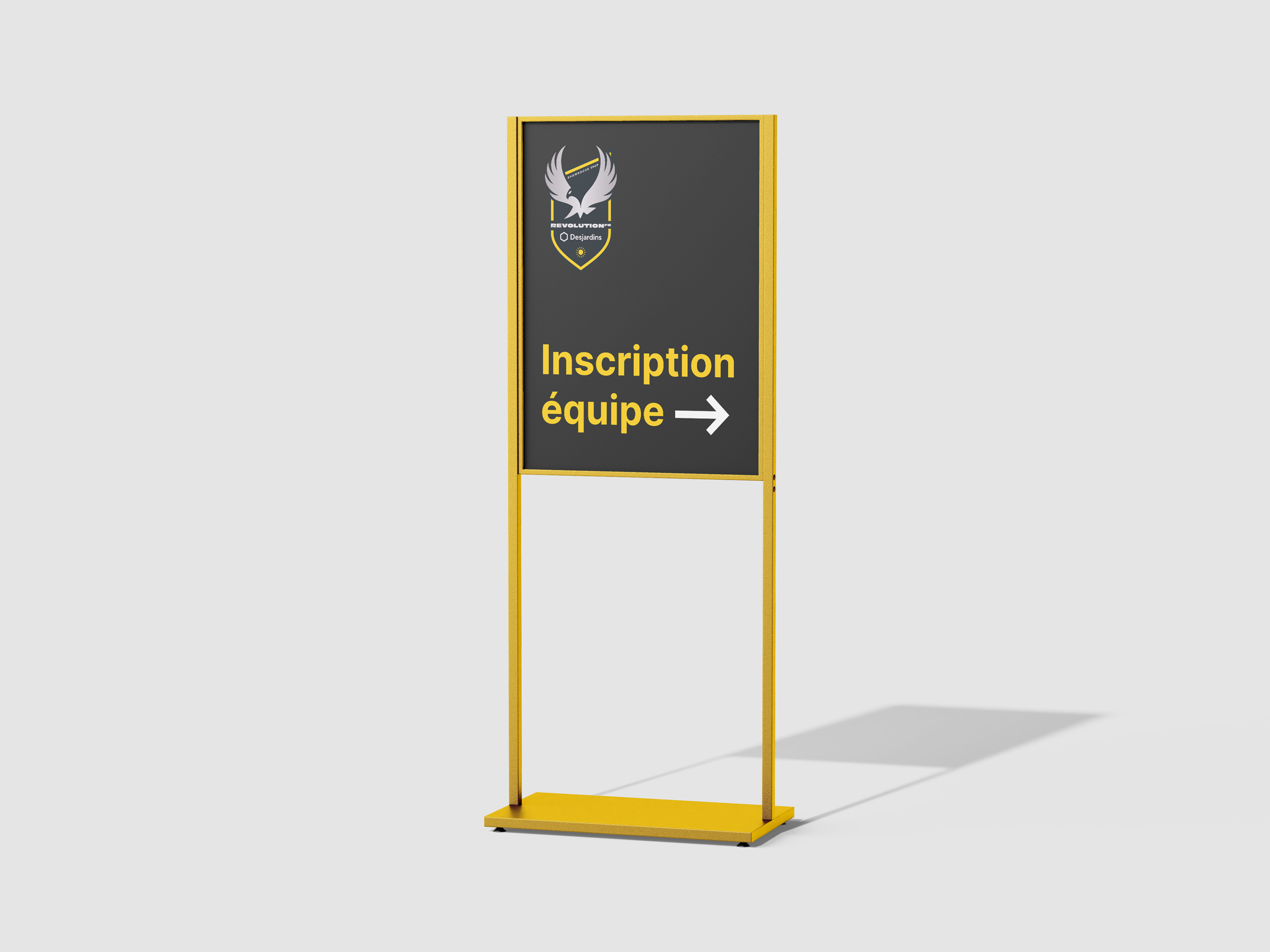
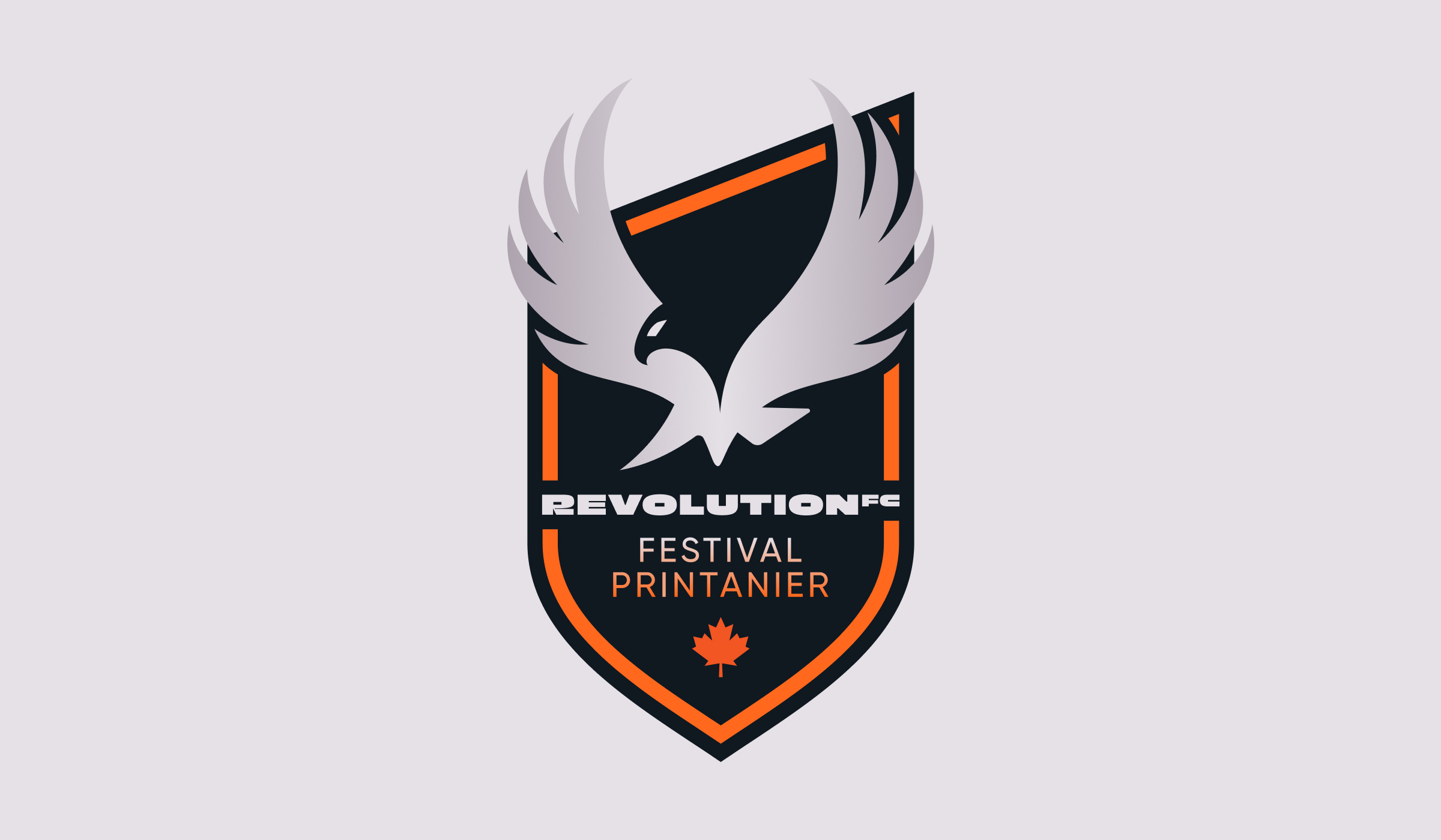
Revolution FC came to us with a dynamic but underutilized symbol—their phoenix. While the club’s core logo was already recognizable, it lacked the impact needed to confidently represent three seasonal tournaments: the Winter Challenge, Spring Festival, and Summer Tournament. Our task: create a cohesive family of logos that would celebrate the spirit of each event and solidify Revolution FC’s overall brand presence.
Ambition
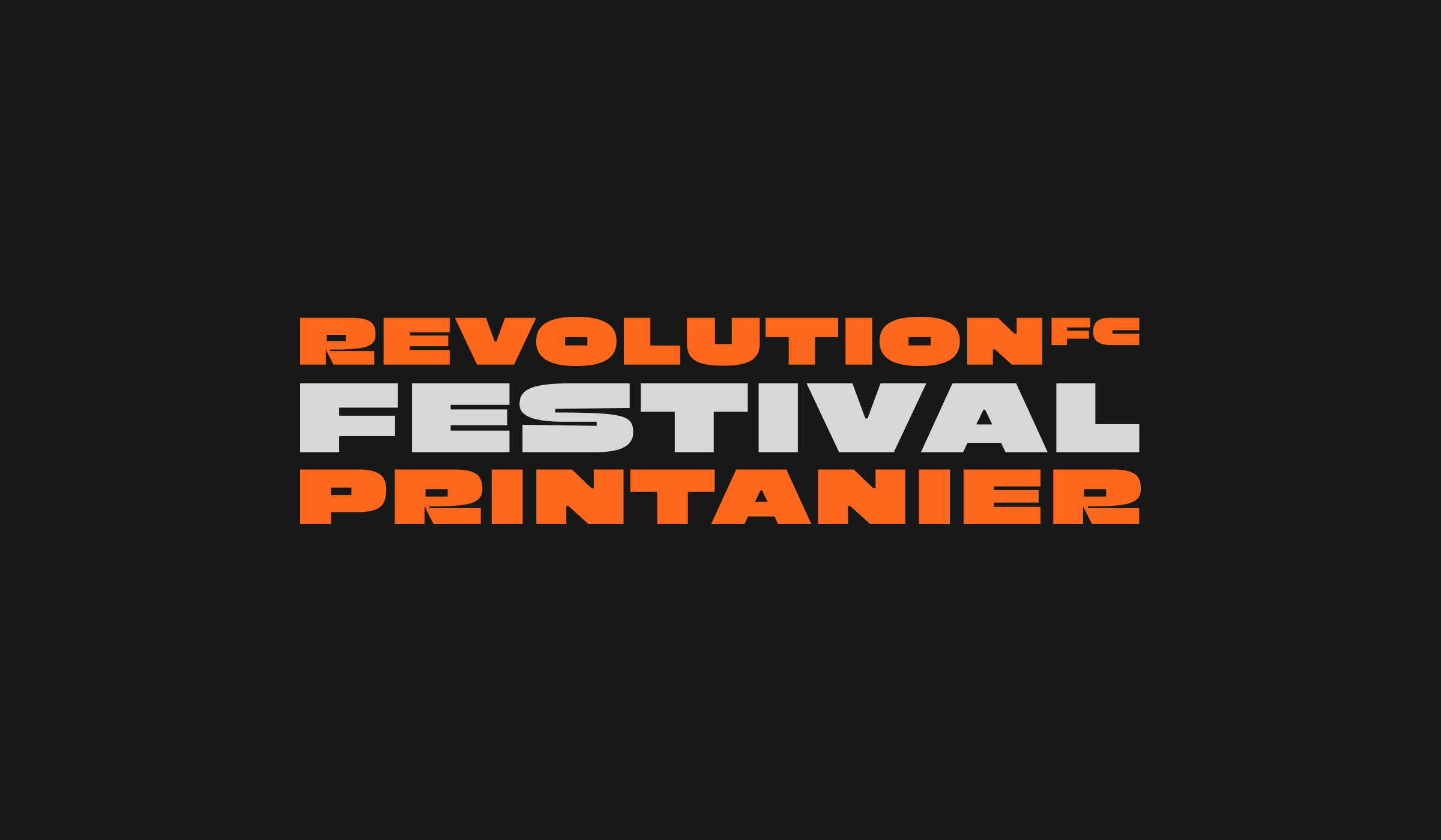
From the outset, the goal was to strengthen the existing phoenix identity and transform it into a distinctive, versatile brand family. Each tournament needed its own personality while still feeling undeniably linked to the main club crest. By refining visual elements, adding strong iconography, and introducing a custom wordmark, we sought to elevate the Revolution FC brand into a unified yet varied experience for players and supporters alike.
Services
- Brand Logo
- Brand Identity